
Using a spreadsheet
Spreadsheets have been one of the most successful programs for personal computers. They are easy to use and extraordinarily powerful. Like most good ideas, the spreadsheet is based on a simple principle. Fundamentally, a spreadsheet is a labeled grid of cells into which we can enter text, numbers, and formulae. The cells are labeled by column and row. The formulae can reference other cells, and it is this that gives a spreadsheet its power.
Although the modern spreadsheet program is highly sophisticated with advanced facilities for statistics and programming, it is possible to benefit enormously from their use while hardly scratching the surface of their functionality. In particular, spreadsheets can make collecting and processing results for experiments extremely convenient. They completely avoid the need to ever start over because of some stupid mistake in a data value or a formula. Just edit the mistake and everything dependent on it is recalculated.
When it comes to plotting a graph, a spreadsheet program like Microsoft Excel makes it simplicity itself, as it is generally just a question of selecting the data you want plotted and then the type of graph you would like. As with derived values, changing a data value will immediately update any graphs that are dependent on the changed values.
If you are completely new to spreadsheets you may find it useful to watch an introductory tutorial on YouTube to get the basics of entering values and formulae.
The spreadsheet application used here is Microsoft Excel, but many others are identical or close to identical in their functionality, often with only minor differences to their user interfaces.
Example Spreadsheet
The following will use the Charles’s law example to show how Excel can be used. Don't worry about knowing this law, it is only necessary to understand what we do with the values that we get from the experiment. Start by giving your sheet a heading and then putting any constants onto the sheet like this.

To do this: click on the B3 cell and type in the string as shown. This is just one cell and it overflows into the next cell as C3 is not being used. It is simply a heading to remind us what the sheet is for.
Then click on E4 and enter the string 'Tube R ='. Then enter the number as shown into F3 and finally enter 'm' into G4.
Now we enter values from the experiment. I've given the values headings, the first column is temperature and the second is a length in cm.

The values in the C column represent the length of a tube which has the radius of 0.0005m as given in cell E4. We need to calculate the volume of the tube for each of the different lengths in the C column. Put a label into D6 to show that the values underneath will be volumes. The first cell to receive a volume will be D8. So, select this cell. Now press equals (this tells Excel that what is coming is a formula rather than a value). You then type in the formula. In this case it is:
=PI()*$F$4*$F$4*C8/100
Which might, at first sight, seem a little complicated. However, it is really quite simple. The volume of a cylinder is given by:
V = П r^2 L
The formula starts with Excel’s way of getting the value for pi, which for Excel is a mathematical function called PI. It has opening and closing brackets because functions sometimes have arguments or parameters that will usually be given between opening and closing brackets. Here there are no parameters, but we still have the brackets.

This is followed by a multiplication with the radius twice; this is the r-squared part (it is actually faster for the computer to work out a square by using multiplication than to invoke exponentiation using the ‘^’ symbol).
The dollar signs are used because when we copy and paste this formula to calculate all the other rows, we want this cell address to be treated as an absolute address and not changed in any way.
Finally, we have the multiplication by C8, which is the length in centimeters, so we divide by 100 to have our result in meters cubed.
Now for the interesting bit. Note that in the above figure, the D8 cell is selected, and it has a black box in the lower right-hand corner. This indicates that it can be dragged downwards, and the correct formulae will be copied into all the cells that you drag to. You should get what is shown below:

The significance of this is that the results of just about any experiment will consist of a column of independent variables (the values we change) and a column of dependent variables, so we can treat the results of virtually any experiment exactly like this, but don't forget to change the headings and formulae!
Now you can appreciate the need for absolute addressing used in the formula. Each use of the cell F4 is absolute; it is always in F4 and nowhere else. If we had not made it absolute, then the pasted formulae would have created offsets from F4.
You may be wondering why these values are so very small. It is because the units of meters cubed are very large when we are calculating volumes in a capillary tube. However, it is always worth doing a quick visual check as we enter formulae to ensure that they make sense.
Creating the Graph
Select all three columns of data by dragging from the top left of the data to the bottom right. With the Insert tab selected from the top of the Excel interface, select the scatter plot icon as shown here:

The small window of scatter chart options appears:

Choose the first of the available scatter plots and you will get this graph placed on your sheet, as shown here:

This is not exactly what we want, so we need to do a few things. Firstly, we seem to have two plots. This is because we chose all three columns of data. From the data and the plots, it is clearly the top one that we do not want. Click on one of the blue data points on the graph and you will see this confirmed on the spreadsheet by those columns of data becoming highlighted.
Press the delete key to get rid of this plot. Now you should be looking at what is shown here:
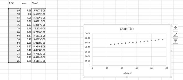
This confirms that you have plotted the correct values. Get rid of the series two label by clicking on it and pressing delete. We do not need it, as we only have one series. We can now change the chart title by clicking on it and entering some new text.
When the chart is selected, you will see a plus sign at the top right. Click on this to see this menu shown here:

Click on the Axis Titles checkbox and then edit them to give you appropriate labels for both axes. Now we want to add a best-fit line. From the menu, click on Trendline and on the small right arrow that appears, click on More Options. This will cause a panel to be displayed on the right with all the Trendline options displayed, as shown here:

Select the linear option, as we want a straight line. It would also be rather nice to have the equation of the line displayed, so click on that option (near the bottom). You may need to drag the label away from the line in order to be able to read it.
Note that the equation, as displayed, has too few decimal places to be of any use. Right-click on the equation label and choose Format Trendline Label from the displayed menu. Under Category, choose Scientific, and specify decimal places as 2. Now we have our graph with a usable equation for the best-fit straight line as shown here:

This section is adapted from material developed by Dr Robert Lucas and is related to the book High School and Undergraduate Physics Practicals, published by CRC Press.